
This is Part 3 of 3 articles talking about what Timely Wanderings is all about. For Part 1 click here. For Part 2 click here.
Before we get into the symbolic meaning of the logo along with the fairly obvious literal meaning, let’s take a quick look at the back-story.
Although I’ve felt God leading me towards this for quite a while now and have been praying about it, I didn’t really take it forward until years later. For the entire story behind this and where this might go someday, God willing, read this post.
While I had been pondering this idea (I’ll admit I didn’t put as much work into it as I should have), I have been blessed to hear God speaking in so many ways- both through others but especially through things in my everyday life. One of these was a message on dreams and about God having a purpose in all of our lives and how we often choose to let it go and never really take hold of it for various reasons. That’s something that has been very true for me. How often do we feel led to do something and then only a moment later find ourselves questioning that leading? How often have we sidestepped a dream and found ourselves moving on for reasons only best known to God and us? On the flip side, how often have we tried to work on something that we were convinced about and yet never found it getting anywhere? Or how often have we driven head first into an idea and put everything we’ve got into it, only to realise that we’ve been barking up the wrong tree?
I think the common thread is a misplaced foundation or trust, or an anchor, if you will. So, when I started taking this seriously and started working on the branding, I didn’t feel like a logo that was inherently/overtly tied to the name would be best. Instead it felt like a symbol would work best. Given how visually inclined our mediums of communication are these days, and how increasingly visually literate we are all becoming, a symbol just felt like a necessity, rather than a want. But it couldn’t be something esoteric. It had to have some obvious meanings that a majority of us would understand at first glance, while also having some subtle and underlying connotations that would go far beyond the surface and the mere look and feel of it. Hence the initial idea behind the logo itself.
To better explain the logo and thoughts behind it, it would be better to break it down in its various parts and aspects. Let’s start with the most obvious element and then move on to the rest of it:
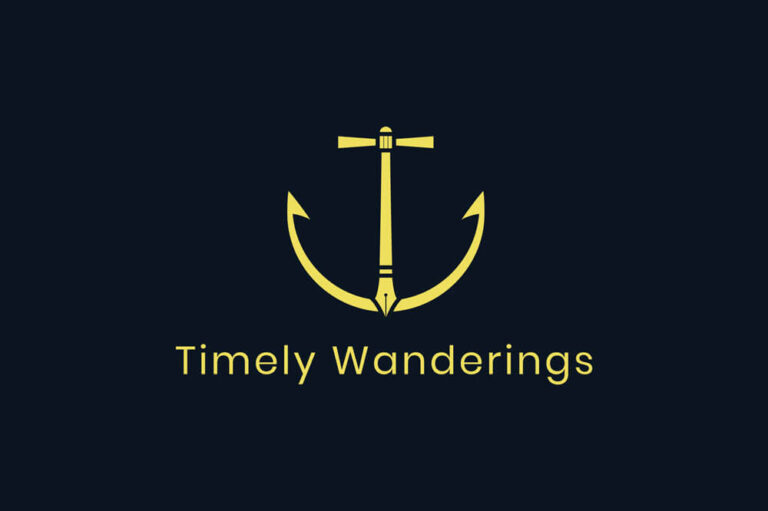
The Anchor – Around the time I began working on the branding, in my personal study, I was going through the book of Hebrews and verses 19, 20 in chapter 6 stood out – “We have this as a sure and steadfast anchor of the soul, a hope that enters into the inner place behind the curtain, where Jesus has gone as a forerunner on our behalf, having become a high priest forever after the order of Melchizedek.” I was immediately reminded of the hymn “We have an anchor”. It’s a hymn that has somehow left a lasting impression in my life. I didn’t quite connect with it initially because the meaning didn’t really become apparent until after I was saved. However, there are two lines “will your anchor hold in the storms of life?”, “will your anchor drift or firm remain?” that have stuck with me. This isn’t something that I’ve actively thought of on a daily basis but it’s often served as a much-needed reminder of where I choose to drop my anchor, so to speak. It was also one of the first things that I was reminded of when the idea for this platform started taking shape. That’s where this anchor comes from. I want this to have a firm foundation in faith in the Lord Jesus Christ and His finished work of salvation for the whole world. A ship not anchored properly will drift from its initial position and that is something that is easy for us all to do on our own – drift. The only way this can stay focused on what’s important and essential is by always ensuring an anchor planted firmly in the foundation of Christ.
The Pen – This might be fairly obvious. This isn’t just supposed to symbolise the blog or the act of writing that would perhaps be synonymous with a platform like this but I’d think it also incorporates creatives and their work. We might be seen as “creators” (I sometimes refer to myself as a content creator), but there is only one true Creator – God. It is from Him that all our ideas flow and it is He who is the true source of our inspiration. But we have been created to create! We should be tools (or vessels) in His hands. Tools that He can freely use for His work, just as an artist uses his/her tools (in this case a writer using a pen), to create works of art. It’s not the tool that matters, but rather the one who wields it. “Therefore, if anyone cleanses himself from what is dishonourable, he will be a vessel for honourable use, set apart as holy, useful to the Master of the house, ready for every good work.” (2 Timothy 2:22) “in order to make known the riches of his glory for vessels of mercy, which he has prepared beforehand for glory— even us whom he has called, not from the Jews only but also from the Gentiles?” (Romans 9:23,24)
The Source of Light – The centre column that extends upwards has a square like shape towards the top. This shape has three divisions. The number three has particular significance in the Bible but for this logo, it is representative of one God in three persons. I had begun experimenting with circles but decided to go with vertical rectangles instead as they are more like pillars. That’s added symbolism – God being the pillar of our very existence. These three pillars are part of one object – one God in three persons. This is inspired by the light at the top of lighthouses. “For by him all things were created, in heaven and on earth, visible and invisible, whether thrones or dominions or rulers or authorities—all things were created through him and for him.” (Colossians 1:16) “yet for us there is one God, the Father, from whom are all things and for whom we exist, and one Lord, Jesus Christ, through whom are all things and through whom we exist.” (1 Corinthians 8:6)
The Beams of Light – There are two shapes that extend to the left and right of the light source. If there’s a source of light, there’s light. Hence, the beams of light emanating from the source. Light emanates from God. God is the source of light. God is light. “Jesus spoke to them, saying, “I am the light of the world. Whoever follows me will not walk in darkness, but will have the light of life.”” (John 8:12) The light that shines into darkness and redeems us. We are supposed to not just reflect that light but also to broadcast it. We have been called to be lights in a dark world by reflecting the Light of the World. “You are the light of the world.” (Matthew 5:14)
The Lighthouse – The centre column of the logo extends vertically and this, along with the light source, and beams forms the shape of a lighthouse. Lighthouses have long been symbolic of safety, refuge, protection, guidance, and even salvation. Our God is a tower of refuge for all those who call upon His name. “The name of the Lord is a strong tower; the righteous man runs into it and is safe.” (Proverbs 18:10) Lighthouses are also typically located on rocks and on higher ground. We have a firm foundation in Jesus Christ “Lead me to the rock that is higher than I, for you have been my refuge, a strong tower against the enemy.” (Psalm 61:3)
The Hooks – Notice the pointed ends of the anchor and remember Christ’s words to Peter and Andrew “Follow me, and I will make you fishers of men.” (Matthew 4:19)
The Cross – The main “T” in the centre is in the rough shape of a cross to act as a reminder that it is the finished work of the Christ on the cross that has bought our freedom from sin. It is His blood that was shed for the cleansing of our impurities. “By cancelling the record of debt that stood against us with its legal demands. This he set aside, nailing it to the cross.” Colossians 2:14 It also serves as a reminder that we must all take up our cross and follow Christ – Jesus says in Mark 8:34 “If anyone would come after me, let him deny himself and take up his cross and follow me. This is not about us but about who God is and what He continues to do. As Paul says, “I have been crucified with Christ. It is no longer I who live, but Christ who lives in me. And the life I now live in the flesh I live by faith in the Son of God, who loved me and gave himself for me.” Galatians 2:20
Pilgrims – There is one more aspect to the logo that I find quite interesting. That is the aspect of us being on a journey. The earth is not our final destination. We are only temporarily here with a promised home in God’s very presence. An anchor when it is still on the boat/ship means that the destination hasn’t been reached and for that period, sailors might very well be pilgrims. We are pilgrims on this earth. We are on a journey. Not just to get to eternity with God but also on a journey towards becoming more and more like Christ Himself as God works in and through us. “But our citizenship is in heaven, and from it we await a Saviour, the Lord Jesus Christ, who will transform our lowly body to be like his glorious body, by the power that enables him even to subject all things to himself.” Philippians 3:20,21
T & W – Now for something a bit more obvious. When I first started out ideating and conceptualising the logo, I tried playing with the words and the alphabets T & W. A T stacked on top of a W is what sparked the creation of the logo into what it is today.
In graphic design, the general rule of thumb is to keep logos as simple as possible without elements that are complex or tiny. This particularly helps when a logo is used in a size that is small (say, for instance, the favicon of a website), and also helps with recognition and readability when a viewer should ideally need only a glance to recognise the symbol and/or its meaning. While this logo does have some tiny elements, they blend well together to keep the overall shape of the anchor intact even if viewed at a smaller size, or at a distance.
There are a few more thoughts behind the symbolism of these elements in the logo but these are the overarching concepts that were present as I worked on designing this.
Let’s talk colours for a moment. Remember that colours are highly subjective- their meaning, symbolism, interpretation, and even their significance varies over time, cultures, geographies, etc. So, these colours are symbolic to Timely Wanderings for various reasons, some of which I’ll go into here. We’ve got three prominent colours:
- Blue – You’ll see this used a lot throughout the site (especially as the background colour).
- Blue itself has various symbolisms- from being a royal hue, to featuring in the Bible itself- from being one of the dyes used in the garments of the high priest to sapphires that are prominent in prophesy and heavenly visions (eg. Exodus 24:10, Ezekiel 1:26, etc.). Blue is used in association with God, while it is also symbolic of royalty.
- What struck me though was how the blue dye was obtained in those days. We don’t know the specifics but a prominent theory is that it was extracted from marine creatures in the Mediterranean Sea. The process was tedious and required multiple repetitions to get the right hue. Think of it this way- God has to constantly and repeatedly cleanse us to get us to be just right- in the image of His Son. That’s the background to Timely Wanderings- we are all in the process of becoming more like Christ Himself.
- Blue is also the colour we generally associate with the sky. Creation speaks of The Creator Himself. We are His Creation, created for His glory!
- Yellow
- Did you know that yellow is the one colour in the visible spectrum of light that appears the brightest? We are to shine bright in a world of darkness. It doesn’t matter what shade of light is around us, we must shine the brightest because we reflect the Light of the world, Christ Himself. We are secondary sources of light where Christ is the primary source. But that’s not the only reason why I was led towards this one.
- Yellow has long been symbolic of holiness, deity, and value (gold). Timely Wanderings must ALWAYS have Christ in the centre. For one, it wouldn’t exist without Christ’s work and two, without Christ leading the way, Timely Wanderings is useless. Christ is the anchor, the foundation, The Creator. Everything else pales in comparison to Him. We are only of value because of Christ. He has changed us into a royal and holy priesthood. God is constantly working to purify us.
- Further, frankincense was an off-yellow colour. We are to present ourselves a living sacrifice, holy and acceptable to God. That is our spiritual worship (Romans 12:1). We must fill every space, every timeline, everything that we do with the sweet-smelling savour of worship to the One True God (2 Corinthians 2:15). When the world looks at us, when the world bears witness to our lives, it MUST see the Saviour who is our life. Everything is only about Him!
- White – This is an interesting colour because it isn’t actually one colour at all- it’s all the colours!
- When it comes to light itself (additive colour), white is obtained by the combination of all the wavelengths of light.
- On one level this is like the Church (the body of Christ) where there are all kinds of people who have been brought together by God and for God. We add, and build each other up.
- The second is God himself- perfect and pure and all encompassing.
- When it comes to subtractive colours (things like printed material), white is the absence of any colour. Printed material is very often a representation of what has been designed on a digital device (which itself uses additive colour). So, our lives as Christians on this earth is often symbolic of higher things. It might seem like God isn’t there but the reality is that without God this wouldn’t exist. It is merely a shadow of things to come- a shadow of God Himself. That is where we are headed – into full and perfect fellowship with our Maker.
- When it comes to light itself (additive colour), white is obtained by the combination of all the wavelengths of light.
409 comments
Susan Jessica
Winning the lottery was part of my dreams, I tried so hard to win big but all to no avail, until I came across Dr Uyi online who made my dreams come through and made me win $16.7 million Euro. I was a logistics manager who lives in Lancaster, S.C. and works about an hour’s drive away, in Charlotte, N.C., I stopped at a store to buy a scratch-off lottery ticket during my lunch break, because Dr Uyi gave me all the assurance that the numbers are not going to fail after I did all he asked me to do. Dr Uyi is a powerful Dr that is on a mission to eradicate poverty from people’s lives and i have confirmed that by winning $16.7 million Euro with the numbers he provided for me, it is my promise to tell the world about my experience with Dr Uyi and that’s what I’m doing now, you can win the lottery fast with the help of Dr Uyi he is tested and trusted Email: drzukalottospelltemple @ gmail. com OR WhatsApp on +17174154115
sabung ayam online
This is very fascinating, You’re an overly professional blogger.
I’ve joined your rss feed and look forward to seeking
more of your wonderful post. Additionally, I’ve shared your
site in my social networks
rtp tombolbet88
When I originally commented I clicked the “Notify me when new comments are added” checkbox and now
each time a comment is added I get three e-mails with the same comment.
Is there any way you can remove me from that service?
Thanks a lot!
slot digital
What i do not understood is actually how you are no longer
actually a lot more well-favored than you might be right now.
You are so intelligent. You realize thus significantly with regards to this matter, produced me in my opinion consider it from a lot of numerous angles.
Its like women and men aren’t fascinated until it’s one thing to do with Girl gaga!
Your individual stuffs great. All the time deal
with it up!
url
I really like looking through an article that can make people think.
Also, thank you for allowing for me to comment!
tirta88
Thank you for another excellent post. Where else may just anyone get that kind of
info in such an ideal method of writing? I’ve a presentation subsequent week, and I
am on the look for such information.
binance prihlásení
Can you be more specific about the content of your article? After reading it, I still have some doubts. Hope you can help me.
neuro sharp purchase
very informative articles or reviews at this time.
binance
Can you be more specific about the content of your article? After reading it, I still have some doubts. Hope you can help me.
binance
Your article helped me a lot, is there any more related content? Thanks!
Meebhoomi Portal
The Meebhoomi Portal and MPBhulekh provide citizens with easy access to important land-related details such as Khasra, Khatauni, Record of Rights (RoR), land map, and village map. These portals aim to promote transparency and convenience, allowing citizens to access land records without the hassle of visiting government offices.
The Brain Song For Memory
I just like the helpful information you provide in your articles
doskonalenie pływania kołobrzeg
I just added your web page to my bookmarks. I really like reading
your posts. Thanks!
edison generator
Pretty! This has been a really wonderful post. Many thanks for providing these details.
the lost generator
I am truly thankful to the owner of this web site who has shared this fantastic piece of writing at at this place.
Goeste
So grateful 💕 for people 🌟 who use 🔥 their platform 💫 to educate 🙏 and inspire others daily
tonybet casino promo code
Thanks for sharing the information. I found the information very useful. That’s a awesome story you posted. I will come back to scan some more.
custom notebook manufacturers
59838 110720Fascinating post. Ill be sticking about to hear much a lot more from you guys. Thanks! 9623
printed quartz slabs
433933 324885learning toys can enable your kids to develop their motor skills quite easily;; 684848
industrial spray coating equipment
674945 697581I like this web site quite much so much outstanding data. 424405
binance註冊
Thank you for your sharing. I am worried that I lack creative ideas. It is your article that makes me full of hope. Thank you. But, I have a question, can you help me?
Neto riska
The post is absolutely fantastic! Lots of great info and inspiration, both of which we all need! Also like to admire the time and effort you put into your website and detailed info you offer! I will bookmark your website!
live webcam sex
Easily, the post is really the greatest on this laudable topic. I concur with your conclusions and will thirstily look forward to your future updates. Saying thank will not just be sufficient, for the wonderful c lucidity in your writing. I will instantly grab your rss feed to stay privy of any updates. Solid work and much success in your business enterprise!
cheap sex shows
I’m impressed, I need to say. Really rarely do I encounter a blog that’s both educational and entertaining, and let me tell you, you have hit the nail on the head.
peak bioboost official
very informative articles or reviews at this time.
best non gamstop casinos
I’ve thought about posting something about this before. Good job! Can I use part of your post in my blog?
casino en ligne
of course like your web-site however you have to check the spelling on several of your posts. Many of them are rife with spelling problems and I find it very troublesome to tell the reality then again I will surely come back again.
newmarket suffolk accountant
Nice piece of info! May I reference part of this on my blog if I post a backlink to this webpage? Thx.
Merko Nisma
Good post. I study something more difficult on different blogs everyday. It’s going to always be stimulating to learn content material from other writers and observe a little bit one thing from their store. I’d prefer to use some with the content material on my blog whether you don’t mind. Natually I’ll give you a link in your web blog. Thanks for sharing.
E23BET
I encountered your site after doing a search for new contesting using Google, and decided to stick around and read more of your articles. Thanks for posting, I have your site bookmarked now.
Lottery Defeated Buy
I truly appreciate your technique of writing a blog. I added it to my bookmark site list and will
Lottery Defeater Buy
Hi there to all, for the reason that I am genuinely keen of reading this website’s post to be updated on a regular basis. It carries pleasant stuff.
serviciu de masa 12 persoane
I just couldnt leave your website before saying that I really enjoyed the useful information you offer to your visitors… Will be back often to check up on new stuff you post!
monte escaliers
It’s continually awesome when you can not only be informed, but also entertained! I’m sure you had fun writing this article. Regards, Clotilde.
video hiếp dâm
very good post, i certainly love this web site, keep on it
monte escalier
This article actually helped me with a report I was doing.
fauteuil monte escalier
Just stumble upon your blog from from time to time. nice article
Pink Salt Trick
What i discover troublesome is to find a weblog that may capture me for a minute however your blog is different. Bravo.
cesti cafea elegante
Surprisingly good post. I really found your primary webpage and additionally wanted to suggest that have essentially enjoyed searching your website blog posts. Whatever the case I’ll always be subscribing to your entire supply and I hope you jot down ever again soon!
geanta termoizolanta
This is something that will need all of our combined efforts to address.
Pink salt trick for weight loss
Hi, I just hopped over to your web-site through StumbleUpon. Not somthing I might typically browse, but I liked your views none the less. Thanks for making something worthy of reading through.
cutie termoizolanta
Glad to be one of many visitants on this amazing site : D.
phim jav
There are some serious financial ramifications here.
watch repair
The post is absolutely fantastic! Lots of great info and inspiration, both of which we all need! Also like to admire the time and effort you put into your website and detailed info you offer! I will bookmark your website!
washing machine repair
bonjour I love Your Blog can not say I come here often but im liking what i c so far….
목포출장마사지
Woh I enjoy your content , saved to bookmarks!
set cafea
Is it okay to put a portion of this on my weblog if perhaps I post a reference point to this web page?
firma verkaufen
A thoughtful insight and ideas I will use on my blog. You’ve obviously spent some time on this. Congratulations
бнанс реферальний код
Can you be more specific about the content of your article? After reading it, I still have some doubts. Hope you can help me.
регистрация в binance
Thank you for your sharing. I am worried that I lack creative ideas. It is your article that makes me full of hope. Thank you. But, I have a question, can you help me?